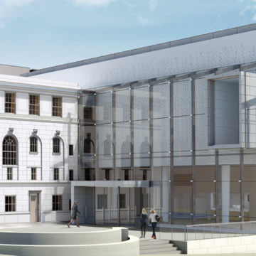
The Asheville Art Museum is opening its renovated and expanded building in 2019, but we have changed our look in other ways, too! Over the past year, the Museum has worked with local design firm 828:design on a new visual identity, which consists of a logotype and a secondary branding element that features a dotted pattern. The new identity is inspired by aesthetics and ideas that are important to the Museum.
Click here for an enlarged view of the new visual identity.
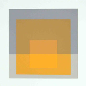
The deep, vibrant yellow is influenced by an iconic work in the Museum’s Collection by prominent Black Mountain College teacher Josef Albers. The Museum’s Collection includes many works by Albers, as well as many works by his Black Mountain College colleagues and students.
The Museo font used in the logotype conveys modernity and strength, complementing the Museum’s focus on American art of the 20th and 21st centuries, as well as the modern architecture of the Museum’s new building.
The dotted pattern matches the perforated pattern that will be a prominent architectural feature on the Museum’s new façade. The pattern reflects randomness and chance, ideas that were explored by artists at Black Mountain College. The pattern also represents education, collaboration, and community: two students from the School of Architecture at UNC Charlotte developed a script through algorithmic modeling to create the random pattern.
Incorporating concepts of modernity, community, and creativity, this new visual identity reflects the mission of the Museum at this exciting moment in its history.


